FRESH THYME MARKET
FRESH THYME MARKET
A guide to living your best life
A guide to living your best life
CREATING AN INFORMATIVE, APPEALING AND APPETIZING BRAND MAGAZINE THAT DELIVERS A WORLD OF POSSIBILITIES
CREATING AN INFORMATIVE, APPEALING AND APPETIZING BRAND MAGAZINE THAT DELIVERS A WORLD OF POSSIBILITIES
FRESH THYME MARKET
Breathing new life into a dated space
A REFRESHED CITY STORE INFUSED WITH INDUSTRIAL NODS, ENERGETIC BRANDING AND A SENSE OF COMMUNITY
The directive: create a more contemporary brand expression while capturing and conveying the essence of the community


What I did: Brand Strategy • Conceptual Design and Direction • Project Management • Agency Direction
Fabrication, Demo and Installation Management and Logistics • Budget Management
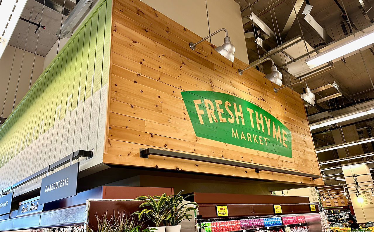
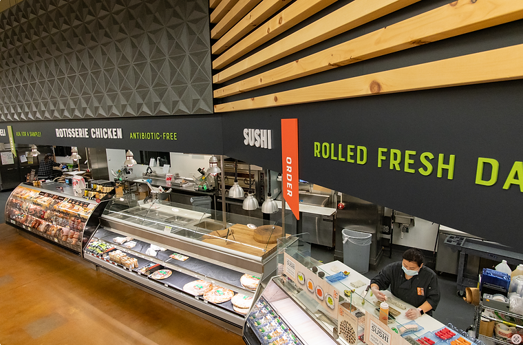
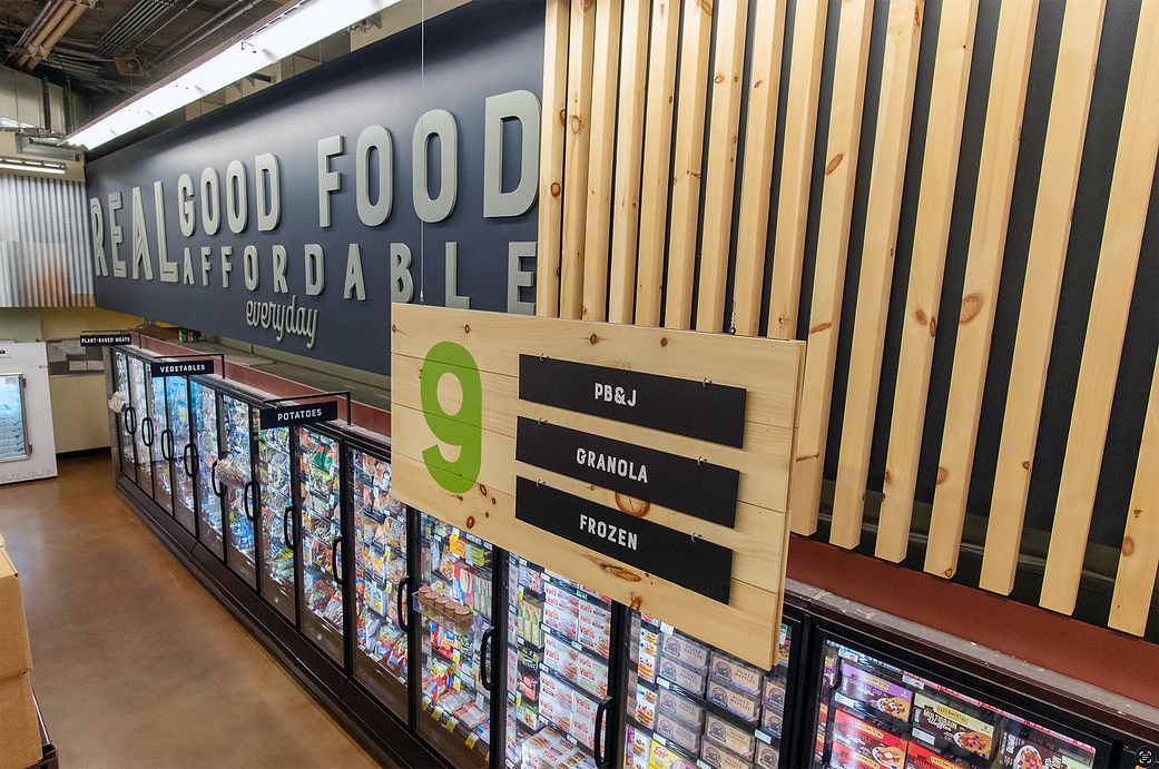
Our Prospect Park store in Minneapolis was chosen as a pilot to upgrade its interior, exterior and merchandising. The goal was to reflect the community through visual cues, textures, and heritage, as well as develop a brighter and more contemporary experience. We employed layered textures, humble materials and clear branded communication ecosystem on multiple levels, from tier one permanent decor to tier two category and point-of-sale, connecting the messaging into a coherent whole.


I developed a localized store logo inspired by the Prospect Park Water Tower, known locally as the Witch's Hat, anchoring a coherent design aesthetic identifying with the community, thus enabling the store to be better integrated into the fabric of the neighborhood.


BEFORE
The store's original decor was outmoded with its unsophisticated typography, faux textures and dark, uninviting vibe. The decor failed to realize its potential as a compelling and influential brand and wayfinding platform, and was completely incongruent with the community aesthetic and demographic.
