top of page


strategy
proposal
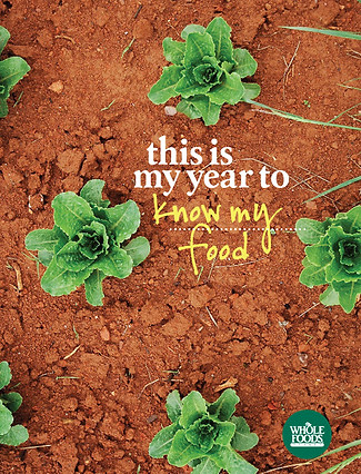
"This concept is meant to be both inspirational and aspirational. Its purpose is to engage the individual customer or team member in thinking about the limitless potential of the new year; I can do anything and be anything I want to be! Some of the collateral will invite the individual to personalize the declaration; by leaving the space blank one is compelled to stop and think, and then mentally complete the statement. It speaks to the power of words, of action, and of optimism and hope. Tactically, the flexibility of the format allows for almost limitless possibilities in the store and beyond. We can target specific products or categories (eat more greens, add grains to my diet) or set the tone for truly ambitious achievements (run the Boston Marathon, build homes in Africa). The format lends itself well to online strategy and has the potential to be a catalyst for increase engagement and dialogue. It is especially relevant as the realization will dawn on many that we are now entering the 2nd decade of the 21st century – carpe annum!"
ADDITIONAL
CAMPAIGN
copY
OPTIONS
THIS IS MY YEAR TO...
"BE WELL"
"RESPECT MY SKIN"
"GROW MY OWN FOOD"
"LIVE MY VALUES"
"ACHIEVE BALANCE"
"BUY ONLY WHAT I NEED"
"CHOOSE ORGANIC"
"DITCH THE ARTIFICIAL"
seafood differentiator counter cards / WHOLE FOODS MARKET
CONCEPT STRATEGY GENERATION • COPYWRITING • LEAD DESIGNER


tales for a carolina belly installation / WHOLE FOODS MARKET
CONCEPT & STRATEGY • COPYWRITING • PROJECT MANAGER • CREATIVE DIRECTION
celebration of southern culinary traditions
environmental branding / north raleigh, nc
"BOIL A MOUNTAIN OF GREENS DOWN TO SMALL EMERALD FOLDS OF GOOD LUCK. SOP STEAMING POTLIKKER WITH BLACK SKILLET CORNBREAD."


"REPEAT!"
"WHETHER PRESSED TOGETHER IN A CAST IRON SKILLET OR ISLANDS RISING ON A BAKING SHEET, BISCUITS ARE SUSTENANCE AND COMFORT."
southern food fest / WHOLE FOODS MARKET

• CONCEPT & STRATEGY
• COPYWRITING
• CREATIVE DIRECTION
AS
SOUTHERN
AS
SWEET
TEA


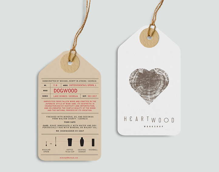
heartwood workshop branding
NAMING • COPYWRITING • CREATIVE DIRECTION
"HARVESTED FROM FALLEN WOOD AND CRAFTED IN THE JAPANESE STYLE OF WABI SABI. ITS AESTHETIC IS CHARACTERIZED BY RUSTICITY AND IMPERFECTION, AND CELEBRATES THE SUBTLE BEAUTY OF THE WOOD AND THE NATURAL PROCESS OF ITS CREATION."
The name is derived from the heartwood of a tree – the dense inner ring yielding the hardest timber – and the passion the craftsman draws on to realize the fullest expression of the wood.
Via Mizner is a luxury development in Boca Raton, Florida, with high-end shopping, dining, residences, a Mandarin Oriental hotel, and a private golf club. I developed the brand mark, brand positioning, and brand language. Featured below is the approved brand position statement. All the descriptive copy, research, and the overarching aesthetic theme were done by me. Following the position statement is a selection of three of the dozens of brand mark concepts I presented to the client. My aim in including these is to highlight my thought process and coherent communication of strategy proposals to the client.
VIA miZner brand positioning & development
BRAND POSITIONING • BRAND MARK AND LANGUAGE DEVELOPMENT


"Concept focuses on one of the development's focal points: the street-side colonnade and its repeating lancet arch, an element typical to Addison Mizner and prevalent in the Mediterranean region. This iteration emphasizes the verticality of the colonnade and its delicate elegance. The mark forms an obvious "M" along with a more subtle "V". Its simplicity and strong shape can be construed literally or abstractly, thus allowing it to be rendered in a variety of formats. "
"Swash letterforms compose this lockup that entwines and complements. The strategic juxtaposition of ornament, formality, and modernity elevates the mark above the stodgy fustiness of competitive brands. The use of weaving and interlacing of details creates an impression of depth; and small graphic elements capture and distill the aesthetic of the property."
"Evoking movement and exuberance, this sinuous mark is inspired by the graceful curvature of the arched facade. The abstract form invites inspection, then discovery, as the monogram comes into focus. In the spirit of Mediterranean decorative elements – iron work, tile – the mark can be used as a pattern or texture in a variety of media. Anchored by the contemporary restraint of the baseline type, both elements are the perfect foil, achieving tension and balance concurrently."
bottom of page